
Designing jerseys for the world’s most iconic teams is no small feat. The task is laden with pressure, as it requires a delicate balance of tradition, modernity, functionality, symbolism, and artistic expression.
The goal? To create a kit that not only unites fans but also boosts the confidence of the players.
However, not all designs hit the mark. This is particularly true for the alternate strip, which isn’t bound by the same stringent ties to tradition. Sometimes, the design team misses the mark, leading to some questionable outcomes.
Brace yourselves as we dive into the archives. We’ve handpicked our selection of the Top 5 Worst Rugby Jerseys of All Time. Prepare to shield your eyes – it’s about to get ugly!
Skip To:
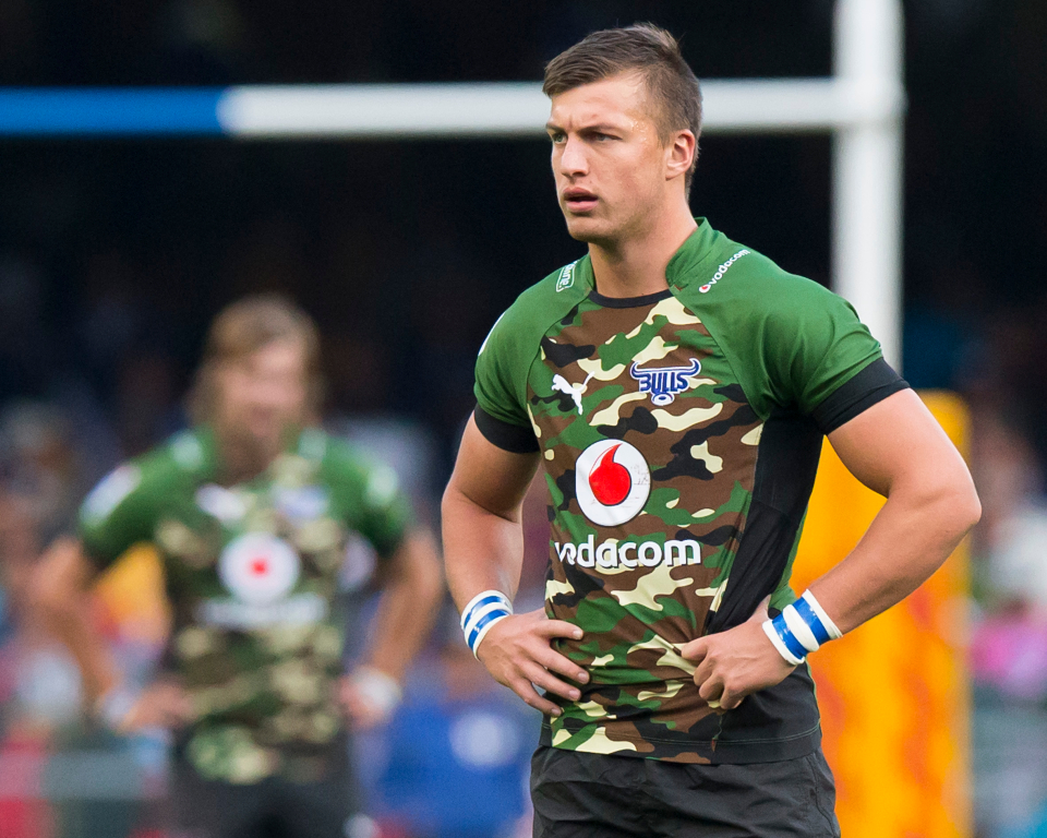
#5. Blue Bulls Alternate Jersey (2014)
John Cena might find himself in a competition with this one – after all, is the goal to be seen or not? (We couldn’t resist that one, sorry!)
Emerging as one of the most contentious jerseys of 2014, the Blue Bulls Alternate shirt didn’t exactly win the hearts of fans. Its camouflage design was a stark departure from the traditional light blue strip associated with the team. The audacious switch to a khaki green and brown colour scheme was met with resistance.
The controversy didn’t stop there. The shirt’s symbolism, presenting a ‘symbol of war’, was widely criticized. Many felt it was inappropriate for a sports team to be associated with military uniforms and warfare.
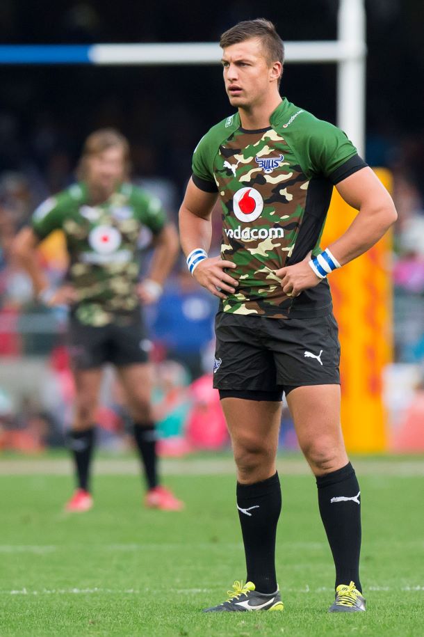
While some fans preferred this design over the 2013 pink jersey, many felt the Bulls were straying from tradition with their camo take. The team later returned to their traditional light blue strip for the Currie Competition.
Barend van Graan, the then CEO of Blue Bulls Company, remarked, ‘We firmly believe that the simplicity, yet elegance of the design makes a bold statement.’
As the saying goes, “better late than never!”
#4. England Sevens Alternate Jersey (2013)
Next in line is the England Sevens Alternate Jersey from 2013/14, a design that certainly raised eyebrows…
While it’s true that some fans appreciated the boldness of the kit, we can’t help but feel it might have crossed a line.
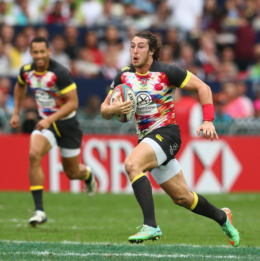
There’s no denying that a splash of colour can be refreshing, but this alternate jersey took a leap away from the traditional white strip.
It incorporated the colours of the English rose in a pixelated image, arranged in a geometric pattern to represent the fluidity and speed of the game.
While we can understand the thought process behind the design, it’s fair to say that the shirt’s aesthetic appeal was questionable.
Just like the Blue Bulls Alternate shirt, this jersey also stirred controversy among fans due to its deviation from tradition. However, as the saying goes, “beauty is in the eye of the beholder!”.
So, while some fans might have found it unattractive, others might have seen it as a refreshing change.
#3. Stade Francais 2010/11 Jersey
Ranked third is the 2010 Stade Francais Jersey. Known for their unique and often unconventional designs, Stade Francais has produced several jerseys over the years that have become instant classics.
However, not all their designs have been well-received, and the 2010 jersey is a prime example.
The effort put into this graphic shirt is commendable when viewed as a standalone piece. Yet, it evokes more of a beach T-shirt vibe than that of sportswear. Unfortunately, it didn’t translate well on the pitch, resulting in a jumbled mix of faces and colours that didn’t resonate with fans.
This jersey marked a departure from the traditional, simpler designs typically associated with rugby jerseys. However, its complexity and visually overwhelming design proved to be too much.
#2. Romania National Rugby Team Jersey (2021)
In 2021, Romania was a formidable force, but their Alternate Team Jersey was a formidable flop.
Venturing into controversial territory here, the Romania National Team Jersey of 2021 is arguably the most questionable piece of kit to emerge from the Macron factory.
Having been unveiled alongside the attractive White Strip, fans were left puzzled, unsure of what to make of the intense striping and bold colouring, which can be likened to the concept of “if McDonald’s had carpets” – it leaves us in a state of uncertainty!
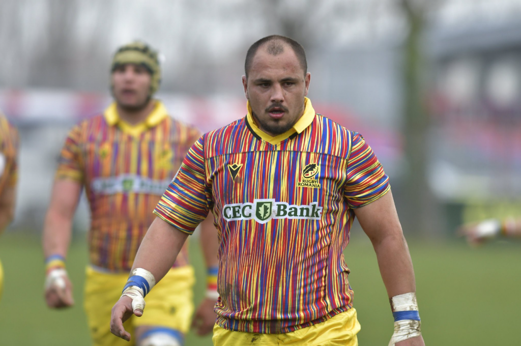
Surely, Macron probably thought this was a modern fusion of the colours of Romania’s flag, but in reality, it appears outdated, as if decorated by a child who got their hands on a Crayola set and let their imagination run wild.
Apologies, but it needed to be said!
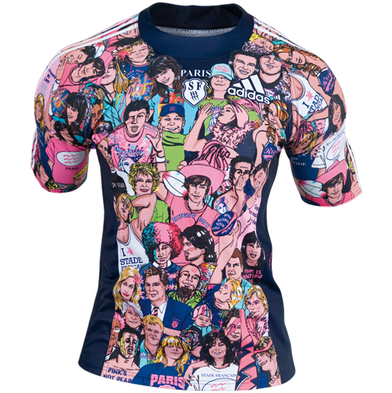
#1. Stade Francais 2009/10 Alternate Jersey
In a daring departure from traditional jersey designs, the Stade Francais Jersey of 2009/10 was a sight to behold, earning the dubious distinction of possibly being the worst rugby jersey of all time.
While the audacious pinks and contrasting blues, which pay tribute to the Parisian team’s colours, can be appreciated, the execution of the graphic elements leaves much to be desired.
More akin to a “Hannah Montana concert T-shirt” than a rugby jersey, the design draws its inspiration from cultural heritage.
But how exactly?
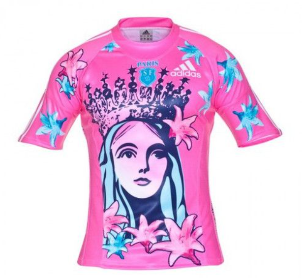
The jersey features an image of Blanche de Castille, wife of Louis VIII and mother of Louis IX. The design was inspired by Andy Warhol’s art style, sparking a debate about the appropriateness of using a distinctive and historical figure on a sports jersey.
The controversy wasn’t solely about the use of the historical figure, but also about the overall design and colour scheme of the jersey. It deviated from typically conservative and simple designs, opting for a bold design that ignited a debate about the role of art and fashion in sports.
When worn on the pitch, it was quite the spectacle, and left a lot of fans scratching their heads thinking, “Did a bunch of Miley Cyrus superfans just storm the pitch?!”.
It’s a bit of eyesore, but you can’t deny, it’s got that iconic status.
Which Jerseys are in your Top 5?
Let us know in the comments which Rugby Jersey you consider to be the worst of all time!
As always, be sure to stay in the loop with the latest Guides, Boot Drops & Rugby News right here at The Full 80.